Design responsive layout system using only 40 lines —Know how to implement col-sm-12 and col-md-6
If you’ve used Bootstrap, you’ve must applied some class name like these for responsive web design(RWD), would you want to know how it works? Let’s step by step to find the magic behind this!
Chinese version: 40行實作響應式的佈局系統 — 告訴你col-sm-12、col-md-6 是如何實現
To read this article, you don’t need:
- Solid coding skill or JavaScript ability
But you need:
- Understanding for-loop, I’ll use SCSS to do the duplicated operations
- Known SCSS
&is point to the nested element - Known about CSS Flex
- Known media query
This article is for someone like me, who wanna find out the responsive implementation in book shop, but most books only teach “how to use Bootstrap“, lol.
About Bootstrap Grid system
For the user who are not familiar with front-end, the bootstrap is really helpful to do the layout, by adding class name like .row / .col / .col-sm-3, we can easily put the container/element to the corresponding size and ratio.

You can see the usage in official documents, you don’t even have to write a line of CSS:
<div class="container">
  <div class="row">
    <div class="col">
      1 of 2
    </div>
    <div class="col">
      2 of 2
    </div>
  </div>
  <div class="row">
    <div class="col">
      1 of 3
    </div>
    <div class="col">
      2 of 3
    </div>
    <div class="col">
      3 of 3
    </div>
  </div>
</div>
Except helping to do layout, Bootstrap provide the breakpoint, we can make the element be responsive:

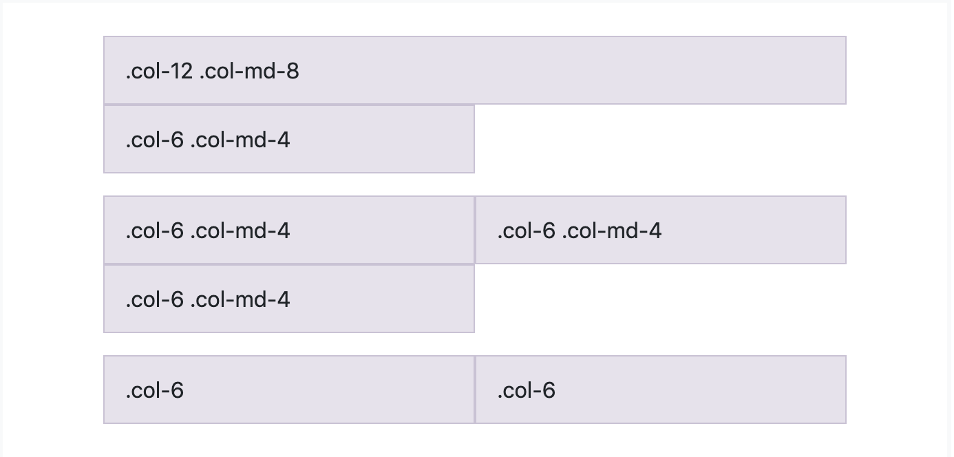
We notice that:
- There’s multiple rows in narrow screen
- In corresponding place by ratio
And you can using the same one HTML to fulfill different device, it’s so called RWD.
By the increasing rate of mobile user, website developer start to focus on better experience for small device (compare to desktop), I thought no one want to keep resizing when browsing the site.
Implementation
The following two items we want to implement are:
- Layout, multiple columns in row, automated grow width (1:1:1)
- Responsive, using different ratio by breakpoint
Layout — row and column
Let’s back to check the simple example, it should be like:
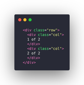
.row{
 /**
 * Do what?
 * display : ??;
 *
 * wrap to next line?
 * ??????? : wrap;
 **/
}
Okay, it’s actually trivial … I just wanna align the left image haha, basically you know the answer if you know the CSS flex.
.row {
 display: flex;
 flex-wrap: wrap;
}
.col{
 flex-grow: 1;
 margin: 15px;
}
Just mentioned, when we don’t have breakpoint, we hope the column could grow up, in another word, we want fill out the whole row, so we define flex-grow: 1;.
Since each column’s flex-grow is 1, so the rest space would be filled by 1:1:…:1.
To show the flex-wrap, I set a min-width to 200px, so you can try to set your width smaller than 600px, the exceed column item would be wrap to next line.
A good beginning is half the battle.
Responsive (1. ratio) — col-1~col-2
We have all 12 grids at all, let’s calculate in each case.
There’s a convenience stuff — for loop, not gonna lie, I basically search for-loop usage in SCSS for implement this…
By the way, there’re some preprocessor for making stylesheet, you might think it’s not really helpful or only using nested, variables, but in developing framework-like system, it plays a good role.
Let’s make different width value by ratio:
@for $i from 1 through 12 {
 .col-#{$i} {
  flex-grow:0;
  flex-basis: calc(-30px + 100% *#{$i}* 1/12);
 }
}
So now, we canceled the flex-grow, since we want it keep the ratio.
Others, we set the columns width in ratio by flex-basis and CSS3 calc.

Just change the number after col-, and see the result! If there’s a col exceed to 12, it’ll be wrap in next line.
Responsive (2. breakpoint) — what’s the sm, md, lg?
We don’t need to find the answer in urgent, let’s think in same figure as above, think what it represent for.

Use a simple logic to think, we always want we have the more columns in large width, and only one column in smaller width (like smartphone), the reason is — we don’t want content small.
If you’re an engineer use bootstrap in usual, you can know this at first sight, by see the other developer do in RWD site, will always see:
<div class="col col-12 col-sm-6 col-md-4 col-lg-2" />In non-nerd words:
— Very narrow width device? One column fills the whole 12 grids!
— Not narrow? but also not wide? One column fills 6 grids!
— Wide and large device? One columns fills 2 grids!
If we have 6 columns, it would be like:
// <sm
12
12
12
12
12
12// sm
6 6
6 6
6 6// md
4 4 4
4 4 4// lg
2 2 2 2 2 2
So … What’s the very small? What’s the very large? Actually it’s defined in document.
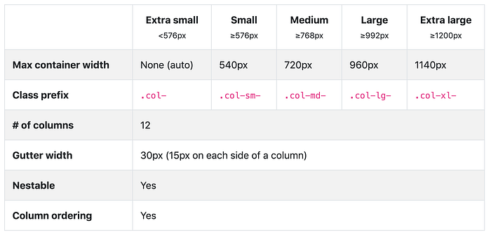
Let’s add these conditions
We all know about there’s a thing’s named media query could help us define style rule in different device width, but what’s the rule we need?
Actually it has the same behavior in each media query, as Responsive(1. ratio) does, we just give the width by the ratio number.
Think you think… by the same figure.
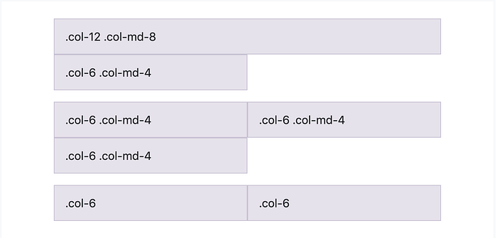
Even we have multiple class name, we only care about that’s width in corresponding size!
Let’s just jog down in different breakpoint:
@media (min-width: 576px) {
    @for $i from 1 through 12 {
      &.col-sm-#{$i} {
        //grow、basis...blabla
      }
    }
}@media (min-width: 768) {
    @for $i from 1 through 12 {
      &.col-md-#{$i} {
        //grow、basis...blabla
      }
    }
}.
.
.
That’s so called responsive breakpoint, let’s see the result:
Conclusion
I could tell you this grid system I design would be the ugliest code, since it’s for tutorial purpose.
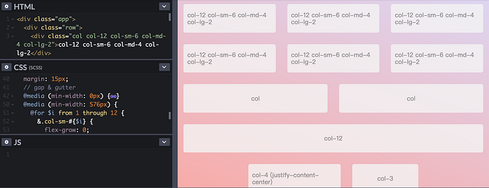
In this implementation, I learn some lessons, making a RWD system is not hard as I image at first, jut hold the basic CSS property, flex.
And the core code only in L38–87, plus all the behaviors are the same in different breakpoint, I try not to use too much SCSS syntax, so it’s hardcore RWD system in the world I think…
Maybe next time, you want make RWD, you don’t really need Bootstrap!
Let’s check the answer with Bootstrap source code
.col-sm-2 {
    flex: 0 0 16.666667%;
    max-width: 16.666667%;
}
So the behavior is the same as what we do calc!
